|
���x��С�����QС����Ӣ����Mini Program����һ�N����Ҫ���d���b����ʹ�õđ��ã������F�ˑ��á��|�ֿɼ����ĉ��룬�Ñ���һ����һ�¼��ɴ��_���á�С������һ�N�������d����ʹ�õđ��ã�Ҳ��һ... ��С�����QС����Ӣ����Mini Program����һ�N����Ҫ���d���b����ʹ�õđ��ã������F�ˑ��á��|�ֿɼ����ĉ��룬�Ñ���һ����һ�¼��ɴ��_���á�С������һ�N�������d����ʹ�õđ��ã�Ҳ��һ��T���dz��ߵĄ��£����^��������İlչ���ѽ��������µ�С�����_�l�h�����_�l�����B�� ��ƪ���½o��Ҏ����ă����ǽ�B��Ό��FС����Ӯ���С����Ӯ��Č��F��������һ���ą����rֵ������Ҫ�����ѿ��ԅ���һ�£�ϣ�����ゃ��������������ͨ�ľW��_�l�У��Ӯ�Ч������ͨ�^css3�팍�F��������С�����_�l��ͬ�ӿ���ʹ�� API���x С�����У�ͨ�^�{�� �����@������ let animation = wx.createAnimation({
duration: 2000,
delay: 0,
timingFunction: "linear",
});�@�� ���ӄ�Ч �����������֮����ԓ������������Ҫ�ĄӑBЧ�����ӑB��Ϳ��Բ���ęn��֪�����Ҋ���Ƅӣ����D������ animation.translate($width, 0).rotate($deg); �Y���Ӯ�
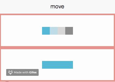
animation.step(); �����Ӯ� �Ӯ�Ч����������ˣ���νo��Ҫ��dom���ӄ�Ч�ء��@����Ҫ�õ� this.setData({ moveOne: animation.export() }) <view animation="{{moveOne}}"></view>���� ����ͨ�^2�M�Ӯ����팦��һ�� һ��ģ�K�ƄӄӮ� �Ӯ�Ч���� �D�ЃɽM�Ӯ����քe��
���a���F ���·քe�� css3�� <!-- wxml -->
<view class='border'>
<view class='css-block {{isMove && "one"}}'></view>
<view class='css-block {{isMove && "two"}}'></view>
<view class='css-block {{isMove && "three"}}'></view>
<view class='css-block {{isMove && "four"}}'></view>
</view> // scss
@mixin movePublic($oldLeft,$oldTop,$left,$top) {
from {
transform:translate($oldLeft,$oldTop);
}
to {
transform:translate($left,$top);
}
}
@mixin blockStyle($color,$name) {
background: $color;
animation:$name 2s linear infinite alternate;
}
.one {
@include blockStyle(lightsalmon,onemove);
}
@keyframes onemove {
@include movePublic(50rpx,-25rpx,-150rpx,0rpx);
}
.two {
@include blockStyle(lightblue,twomove);
}
@keyframes twomove {
@include movePublic(0rpx,25rpx,-50rpx,0rpx);
}
.three {
@include blockStyle(lightgray,threemove);
}
@keyframes threemove {
@include movePublic(0rpx,25rpx,50rpx,0rpx);
}
.four {
@include blockStyle(grey,fourmove);
}
@keyframes fourmove {
@include movePublic(-50rpx,-25rpx,150rpx,0rpx);
} // js
moveFunction(){
this.setData({
isMove: true
})
}
api�� moveClick(){
this.move(-75,-12.5,25,'moveOne');
this.move(-25,12.5, 0,'moveTwo');
this.move(25, 12.5,0,'moveThree');
this.move(75, -12.5,-25,'moveFour');
this.moveFunction(); // ԓ�¼��|�lcss3ģ�K�M���Ƅ�
},
// ģ�K�Ƅӷ���
move: function (w,h,m,ele) {
let self = this;
let moveFunc = function () {
    let animation = wx.createAnimation({
        duration: 2000,
        delay: 0,
        timingFunction: "linear",
    });
animation.translate(w, 0).step()
self.setData({ [ele]: animation.export() })
let timeout = setTimeout(function () {
animation.translate(m, h).step();
self.setData({
// [ele] ������Ҫ�����Ӯ��Ĕ��M����
[ele]: animation.export()
})
}.bind(this), 2000)
}
moveFunc();
let interval = setInterval(moveFunc,4000)
}Ч���D��Ҋ��ģ�K֮�g���Ǻ��ε��Ƅӣ����Ԍ��������\��׃������һ���������¼���ͨ�^���¼���ֵ�����Ƅӵ���ͬ��λ�á����еą��� ͨ�^�@�N�����a���ĄӮ����o������ԭ��܉�E�ջأ��������¼�֮���O���˶��r�������x�ڈ��ЄӮ�2s֮������һ���Ӯ���ͬ�r�Ӯ�ֻ�܈���һ���������Ҫѭ�h�Ą�Ч��Ҫ����Ӱ���һ���؏͈��еĶ��r������ �鿴Դ�a���l�F
��ӡ���xֵ��
�����������ńӮ� �����ģ�K�ƄӄӮ����漰߉����������Lԇ��һ���������ńӮ���ԓ�Ӯ���Ҫ���F��ͣ���^�m��Ч���� �Ӯ�Ч����
�ɽM��ͬ�ĄӮ�Ч�����ȣ��քe��
���a���F ���·քe�� css3�� <!-- wxml -->
<view class='music musicTwo musicRotate {{playTwo ? " ": "musicPaused"}} ' bindtap='playTwo'>
<text class="iconfont has-music" wx:if="{{playTwo}}"></text>
<text class="iconfont no-music" wx:if="{{!playTwo}}"></text>
</view> // scss
.musicRotate{
animation: rotate 3s linear infinite;
}
@keyframes rotate{
from{
transform: rotate(0deg)
}
to{
transform: rotate(359deg)
}
}
.musicPaused{
animation-play-state: paused;
} // js
playTwo(){
this.setData({
playTwo: !this.data.playTwo
},()=>{
let back = this.data.backgroundAudioManager;
if(this.data.playTwo){
back.play();
} else {
back.pause();
}
})
}ͨ�^ api: <!-- wxml -->
<view class='music' bindtap='play' animation="{{play && musicRotate}}">
<text class="iconfont has-music" wx:if="{{play}}"></text>
<text class="iconfont no-music" wx:if="{{!play}}"></text>
</view> // js
play(){
this.setData({
play: !this.data.play
},()=>{
let back = this.data.backgroundAudioManager;
if (!this.data.play) {
back.pause();
// ���¼�������r��
clearInterval(this.data.rotateInterval);
} else {
back.play();
// �^�m���D��this.data.iӛ������D�ij̶�
this.musicRotate(this.data.i);
}
})
},
musicRotate(i){
let self = this;
let rotateFuc = function(){
i++;
self.setData({
i:i++
});
let animation = wx.createAnimation({
duration: 1000,
delay: 0,
timingFunction: "linear",
});
animation.rotate(30*(i++)).step()
self.setData({ musicRotate: animation.export() });
}
rotateFuc();
let rotateInterval = setInterval(
rotateFuc,1000
);
// ȫ�ֶ��r�¼�
this.setData({
rotateInterval: rotateInterval
})
}ͨ�^
���a׃���� �D���Կ�����
���� ͨ�^�����ɂ�С���ӌ��ȣ��oՓ�DZ�ݶ�߀�Ǵ��a����ͨ�^
�C�����ϣ����]ͨ�^ ���Ͼ�����Ό��FС����Ӯ���С����Ӯ��Č��F������Ԕ�����ݣ�����Ո�Pעphp���ľW�������P���£� С������һ�N����Ҫ���d���b����ʹ�õđ��ã������F�ˑ��á��|�ֿɼ����ĉ��룬�Ñ���һ������һ�¼��ɴ��_���á� |
��ܰ��ʾ��ϲ�g��վ��Ԓ��Ո�ղ�һ�±�վ��
��վ�l����Win7������ϵ�y��Win10�������XP������ϵ�y�H�邀�ˌW���yԇʹ�ã�Ո�����d��24С�r�Ȅh�������������κ��̘I��;����t�����ؓ��Ո֧��ُ�Iܛ����ܛ����
��վ�����YԴȫ�������ھW�j�YԴ,���ַ������ę���,Ո���r֪ͨ�҂�(peng896066052@126.com),�҂������r̎��.
Copyright © 2018-2020 ����ľ�L���dվ