|
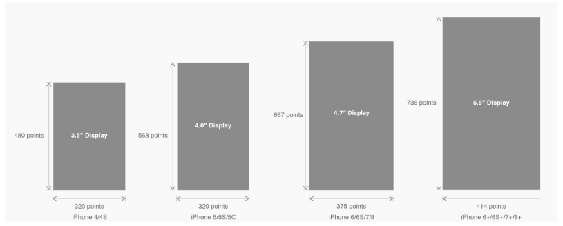
���x1. iPhoneX�Ľ�B ��Ļ�ߴ��҂���֪��iPhoneϵ���_�l�ߴ��Ҫ���£��� iPhone���C�͵��_�l�ߴ��D�����҂���֪�����سߴ磺�� ÿ���C�͵Ķ�S�ȳߴ籶�D�䌍�������سߴ���_�l�ߴ�ı�... 1. iPhoneX�Ľ�B ��Ļ�ߴ� �҂���֪��iPhoneϵ���_�l�ߴ��Ҫ���£�
�� iPhone���C�͵��_�l�ߴ� �D�����҂���֪�����سߴ磺
�� ÿ���C�͵Ķ�S�ȳߴ� ���D�䌍�������سߴ���_�l�ߴ�ı����Pϵ�����@ֻ�����ڵı��F�����D���ĵ�Ӱ���������PPI��DPI�����˽���Ļ�ܶ��c���ߴ���Pϵ�������҂�������ⱶ�ʵĸ�������A֪�R�W���������OӋ�����������DPIָ�ϡ� iPhone8�ڱ��������У���Ļ�ߴ�ͷֱ��ʶ��z����iPhone6�Ժ�ă������y�� Ȼ��iPhone X �oՓ������Ļ�ߴ硢�ֱ��ʡ��������Π��϶��l�����^��ĸ�׃��������iPhone 8���酢�����������iPhone X���m���҂�Ҫ��ô���]�� �҂�����iPhone X�ߴ��ϵ�׃����
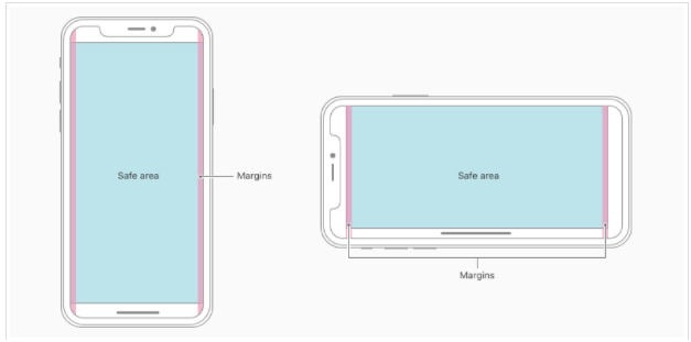
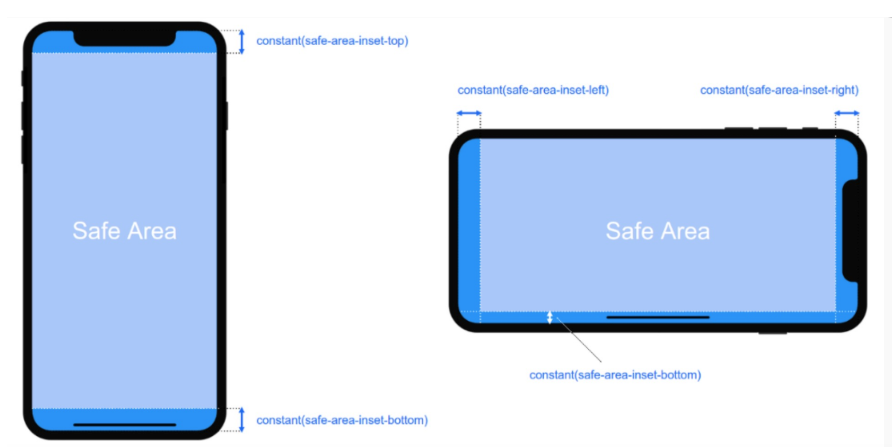
2. iPhoneX���m��---��ȫ�^��(safe area) �O������ iPhone X ���OӋ������Ҋ���£�
���ă��ݑ�ԓ̎�� Safe area �_���������O��A��(corners)���������⚤(sensor housing���R����) �Լ��ײ��� Home Indicator �ړ���Ҳ�����f �҂��OӋ�@ʾ�ă��ݑ�ԓ�M���ܵ��ڰ�ȫ�^��ȣ� 3. iPhoneX���m��---�m�䷽��viewport-fit 3.1 PhoneX���m�䣬��iOS 11�в�����viewport-fit��meta�˺������m�䷽����viewport-fit��Ĭ�Jֵ��auto�� ���� viewport-fitȡֵ���£�
���� viewport-fit meta�˺��O��(cover�r) <meta name="viewport" content="width=device-width,initial-scale=1.0, minimum-scale=1.0, maximum-scale=1.0, user-scalable=no, viewport-fit=cover"> 3.2 css constant()���� �csafe-area-inset-top &safe-area-inset-left &safe-area-inset-right &safe-area-inset-bottom�Ľ�B
���ψD��ʾ ��iOS 11�е�WebKit������һ���µ�CSS����constant()���Լ�һ�M�Ă��A���x�ij�����safe-area-inset-left,safe-area-inset-right,safe-area-inset-top��safe-area-inset-bottom�����ϲ�һ��ʹ�Õr�����S��ʽ����ÿ������İ�ȫ�^��Ĵ�С�� 3.1���҂��O��viewport-fit:contain,Ҳ����Ĭ�J�ĕr��r;�O��safe-area-inset-left,safe-area-inset-right,safe-area-inset-top��safe-area-inset-bottom�ȅ����r�������õġ� 3.2���҂��O��viewport-fit:cover�r���O������
body {
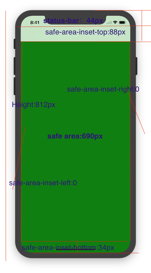
padding-top: constant(safe-area-inset-top); //�錧����+��B�ڵĸ߶� 88px
padding-left: constant(safe-area-inset-left); //���δ�Q���r��0
padding-right: constant(safe-area-inset-right); //���δ�Q���r��0
padding-bottom: constant(safe-area-inset-bottom);//����A���ĸ߶� 34px
}
4. iPhoneX���m��---�߶ȽyӋ viewport-fit:cover + ������ ���� 5.iPhoneX���m��---ý�w��ԃ ע���@����õ���690px(safe area�߶�)������812px;
@media only screen and (width: 375px) and (height: 690px){
    body {
        background: blue;
    }
}
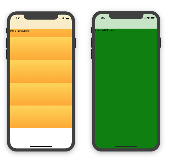
6.iphoneX viewport-fit ���}���Y 1.�P��iphoneX ���ʹ���˝u׃ɫ�r�����viewport-fit:cover; 1.1���O���˱���ɫ��ɫ�͝u׃ɫ�ą^�e������dž�ɫ�r�����������Ļ������O���˝u׃ɫ ��ôֻ��������Ԫ�صĸ߶�ȥ��Ⱦ���������ĸ߶�ֻ��690px�߶ȣ�����ʹ����padding-top:88px; ���� body�̶��飺 <body><div class="content">this is subElement</div></body> 1.��ɫ�r��
* {
           padding: 0;
           margin: 0;
       }
       body {
           background:green;
           padding-top: constant(safe-area-inset-top); //88px
           /*padding-left: constant(safe-area-inset-left);*/
           /*padding-right: constant(safe-area-inset-right);*/
           /*padding-bottom: constant(safe-area-inset-bottom);*/
       }
2.�u׃ɫ
* {
           padding: 0;
           margin: 0;
       }
       body {
           background:-webkit-gradient(linear, 0 0, 0 bottom, from(#ffd54f), to(#ffaa22));
           padding-top: constant(safe-area-inset-top); //88px
           /*padding-left: constant(safe-area-inset-left);*/
           /*padding-right: constant(safe-area-inset-right);*/
           /*padding-bottom: constant(safe-area-inset-bottom);*/
       }
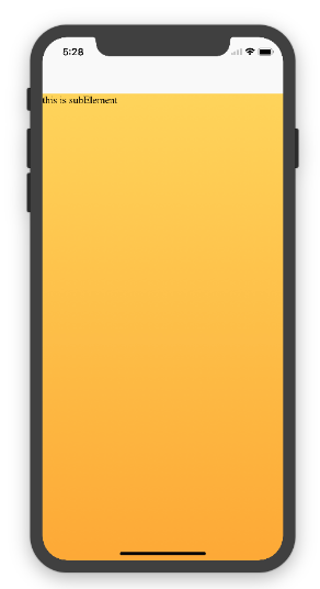
��Qʹ�Ýu׃ɫ ���f���������Ļ�ķ�����CSS�O������
<!DOCTYPE html>
<html>
<head>
   <meta name="viewport" content="initial-scale=1, viewport-fit=cover">
   <title>Designing Websites for iPhone X: Respecting the safe areas</title>
   <style>        * {
       padding: 0;
       margin: 0;
   }
   html, body {
       height: 100%;
   }
   body {
       padding-top: constant(safe-area-inset-top);
       padding-left: constant(safe-area-inset-left);
       padding-right: constant(safe-area-inset-right);
       padding-bottom: constant(safe-area-inset-bottom);
   }
   .content {
       background: -webkit-gradient(linear, 0 0, 0 bottom, from(#ffd54f), to(#ffaa22));
       width: 100%;
       height: 724px;
   }    </style>
</head>
<body>
<div class="content">this is subElement</div>
</body>
</html>
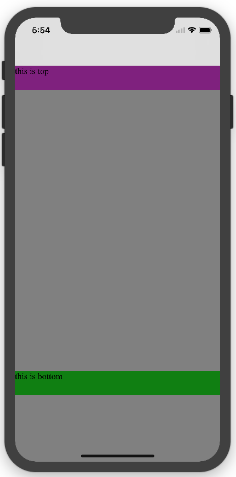
2.���Ԫ��ʹ���˹̶���λ���m�伴��{position:fixed;} 2.1 ��Ԫ�����̶��ڵײ��r��ʹ��viewport-fit:contain�r;���Կ���bottom:0�rֻ���@ʾ�ڰ�ȫ�^��ȣ�
<!DOCTYPE html>
<html>
<head>
   <meta name="viewport" content="initial-scale=1">
   <!--<meta name="viewport" content="initial-scale=1, viewport-fit=cover">-->
   <title>Designing Websites for iPhone X: Respecting the safe areas</title>
   <style>
       * {
           padding: 0;
           margin: 0;
       }
       /*html,body {*/
           /*height: 100%;*/
       /*}*/
       body {
           background: grey;
           /*padding-top: constant(safe-area-inset-top);*/
           /*padding-left: constant(safe-area-inset-left);*/
           /*padding-right: constant(safe-area-inset-right);*/
           /*padding-bottom: constant(safe-area-inset-bottom);*/
       }
       .top {
           width: 100%;
           height: 44px;
           background: purple;
       }
       .bottom {
           position: fixed;
           bottom: 0;
           left: 0;
           right: 0;
           height: 44px;
           color: black;
           background: green;
       }
   </style>
</head>
<body>
   <div class="top">this is top</div>
   <div class="bottom">this is bottom</div>
</body>
</html>
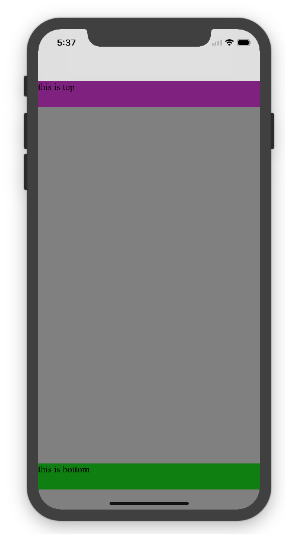
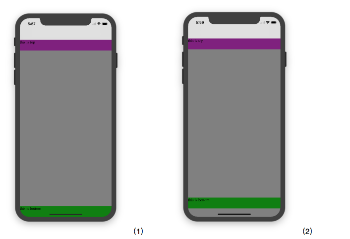
2.1 ��Ԫ�����̶��ڵײ��r��ʹ��viewport-fit:cover�r;���Կ���bottom:0�rֻ���@ʾ�ڰ�ȫ�^��ȣ�
����html,body {width:100%;heigth:100%}
�D1��
* {
           padding: 0;
           margin: 0;
       }
       html,body {
           height: 100%;
       }
       body {
           background: grey;
           padding-top: constant(safe-area-inset-top);
           padding-left: constant(safe-area-inset-left);
           padding-right: constant(safe-area-inset-right);
           padding-bottom: constant(safe-area-inset-bottom);
       }
       .top {
           width: 100%;
           height: 44px;
           background: purple;
       }
       .bottom {
           position: fixed;
           bottom: 0;
           left: 0;
           right: 0;
           height: 44px;
           color: black;
           background: green;
       }
�D2��
* {
           padding: 0;
           margin: 0;
       }
       html,body {
           height: 100%;
       }
       body {
           background: grey;
           padding-top: constant(safe-area-inset-top);
           padding-left: constant(safe-area-inset-left);
           padding-right: constant(safe-area-inset-right);
           /*padding-bottom: constant(safe-area-inset-bottom);*/
       }
       .top {
           width: 100%;
           height: 44px;
           background: purple;
       }
       .bottom {
           position: fixed;
           bottom: 0;
           left: 0;
           right: 0;
           height: 44px;
           color: black;
           background: green;
       }
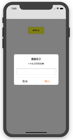
2.3 �P��alertView���� ���ӵĽ�Q����
<!DOCTYPE html>
<html lang="en">
<head>
<meta charset="UTF-8">
<!--<meta name="viewport" content="width=device-width, initial-scale=1.0, minimum-scale=1.0, maximum-scale=1.0, user-scalable=no">-->
<meta name="viewport" content="width=device-width,initial-scale=1.0, minimum-scale=1.0, maximum-scale=1.0, user-scalable=no, viewport-fit=cover">
<meta http-equiv="pragma" content="no-cache">
<meta http-equiv="cache-control" content="no-cache">
<meta http-equiv="expires" content="0">
<title>alertView</title>
<script data-res="eebbk">
document.documentElement.style.fontSize = window.screen.width / 7.5 + 'px';
</script>
<style>
* {
margin: 0;
padding: 0;
}
html,body {
width: 100%;
height: 100%;
}
body {
font-size: 0.32rem;
padding-top: constant(safe-area-inset-top);
padding-left: constant(safe-area-inset-left);
padding-right: constant(safe-area-inset-right);
padding-bottom: constant(safe-area-inset-bottom);
}
.content {
text-align: center;
}
.testBut {
margin: 50px auto;
width: 100px;
height: 44px;
border: 1px solid darkgray;
outline:none;
user-select: none;
background-color: yellow;
}
</style>
<link href="alertView.css" rel="stylesheet" type="text/css">
</head>
<body>
<section class="content">
<button class="testBut" onclick="showLoading()">������d</button>
</section>
<script type="text/javascript" src="alertView.js"></script>
<script>
function showLoading() {
UIAlertView.show({
type:"input",
title:"��ܰ��ʾ", //���}
content:"VIP���T��������", //�@ȡ�µ�
isKnow:false
});
var xx = new UIAlertView();
console.log(xx);
}
</script>
</body>
</html>
���Y ����������С���o��ҽ�B�����PHTML5�����iPhoneX�m�䆖�}��ϣ��������������������������κ��Ɇ�Ո�o�����ԣ�С�������r�؏ʹ�ҵġ��ڴ�Ҳ�dz����x��Ҍ���վ�Wվ��֧�֣� |
��ܰ��ʾ��ϲ�g��վ��Ԓ��Ո�ղ�һ�±�վ��
��վ�l����Win7������ϵ�y��Win10�������XP������ϵ�y�H�邀�ˌW���yԇʹ�ã�Ո�����d��24С�r�Ȅh�������������κ��̘I��;����t�����ؓ��Ո֧��ُ�Iܛ����ܛ����
��վ�����YԴȫ�������ھW�j�YԴ,���ַ������ę���,Ո���r֪ͨ�҂�(peng896066052@126.com),�҂������r̎��.
Copyright © 2018-2020 ����ľ�L���dվ